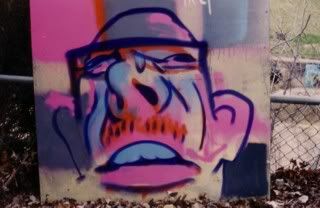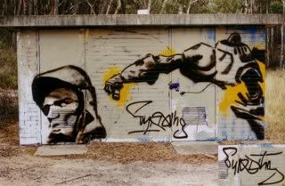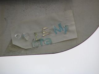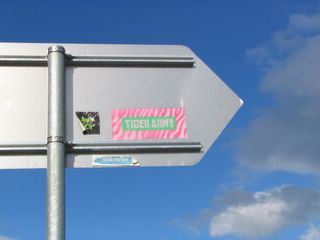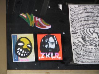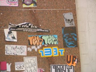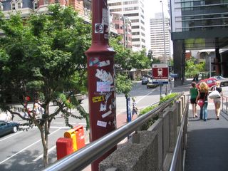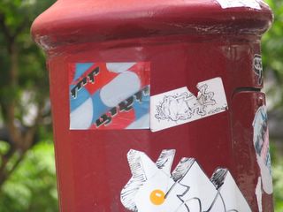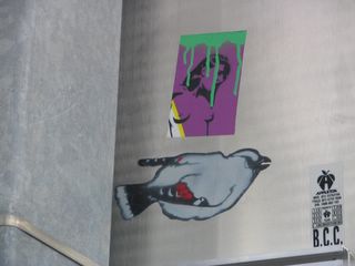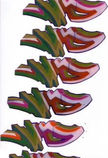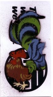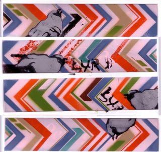
Don't know if this is from a band or brand logo, but i like the compositon, inclueding the overspray. At first i thought these a riff off the bacardi label, but now i think some band like HIM(or is that a brand?). It seems to me rare that street workers achieve this kind of polished logotype. I canni say if that is through deliberate lo-tech methods, zero engagement in formal aesthetics or a misdirected sense of placement.Ie;telling themselves that 'to work in this field i should inhabit a particular aesthetic', forgetting that the icons and idols of the scene persue new or varient aesthetics. Swoon= strong characterisation and community through cut outs and now printmaking; Above= what a focus on placement can do, even without a tasty aesthetic; Sat= the elements of old school graff applied to figures rather than letters(heavey outlines,bright keylines, form reduced to key elements and then distorted etc).

